Pride and Prejudice (Peacock edition)
London: George Allen, 1894.
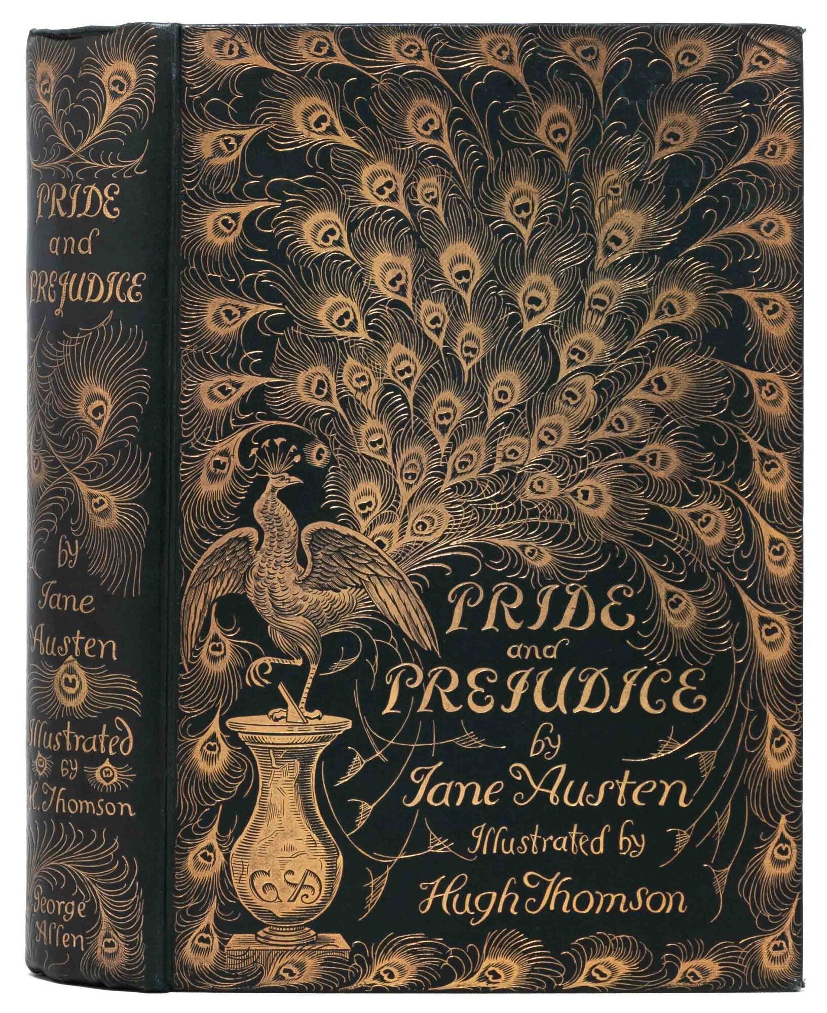
Pride and Prejudice (Peacock edition)
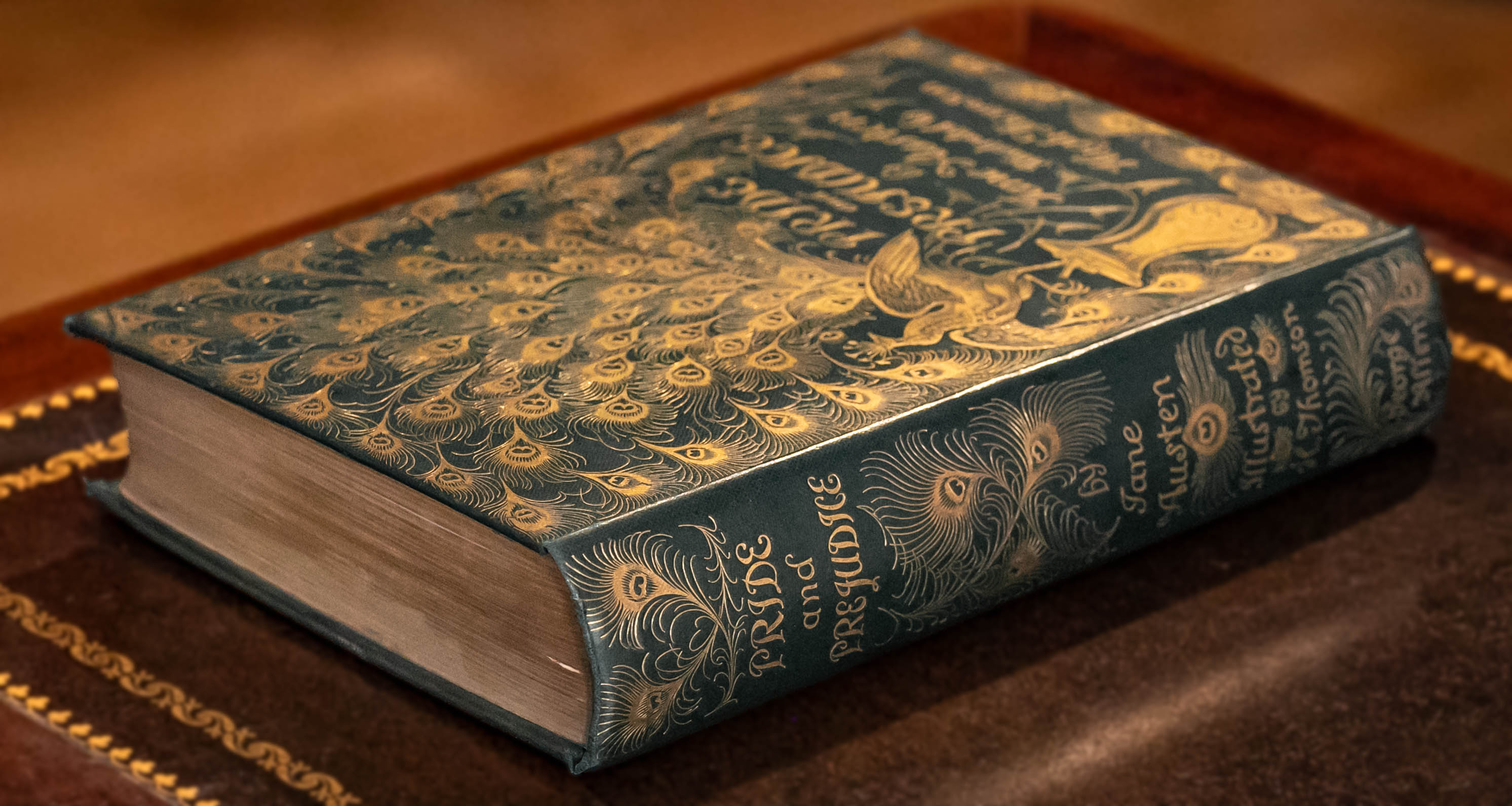
London: George Allen, 1894. First thus. The first edition, first printing of the stylish and beloved "peacock edition." A bright, Near Fine copy in the iconic green publisher's cloth binding with ornate gilt peacock design. All edges gilt. A few little dings to the corners and slight foxing to the preliminaries and the flyleaves. Dark green endpapers with inner hinges firm and uncracked. With the book label of H. K. Burnet to upper pastedown. A very handsome example overall.
Austen was not yet twenty (like Elizabeth Bennet) when she drafted the novel, under the title First Impressions, between October 1796 and August 1797. Declined by the publisher Cadell, it subsequently underwent major revisions including a title change to Pride and Prejudice. Finally, in late 1812, the novel was accepted by Egerton and published in early 1813. The book sold well and was obviously much talked about, not least because of the unknown identity of the author. Anne Isabella Milbanke (the future Lady Byron) called it "a very superior work," and the dramatist Richard Sheridan described it as “the cleverest thing he [had] ever read." Almost two hundred years later, the novel is as popular as ever, widely loved and frequently adapted.
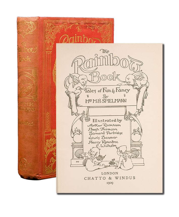
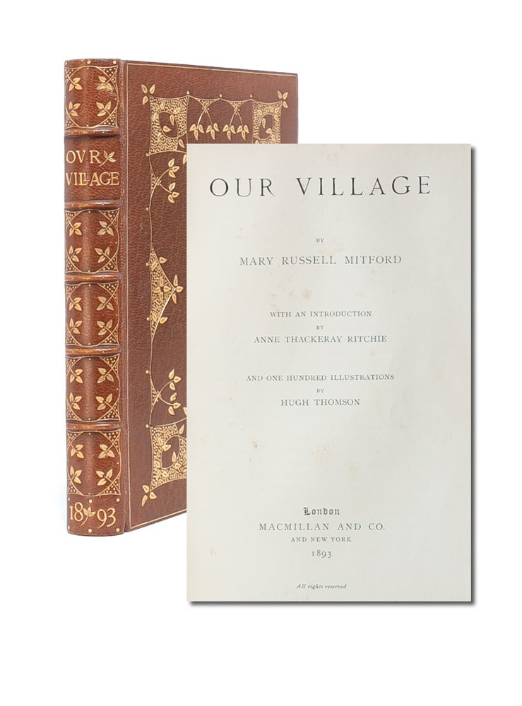
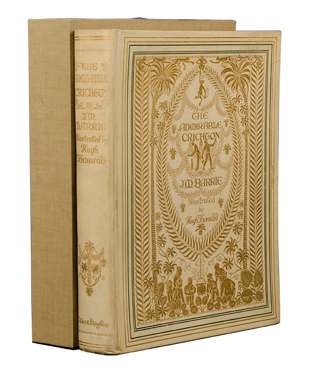
The illustrator, Hugh Thomson, was most famous for his illustrated editions of Austen and Charles Dickens. Known for his attention to detail, Thomson would often spend a great deal of time in museums researching the lifestyles and dress of the characters he was depicting. Thomson started working on his drawings for Pride and Prejudice in 1893. His "light touch and feeling for period manners provide a charming and accessible gloss to the author's work" (ODNB). The project proved an immense success, selling over 10,000 copies in the few years after the publication of the first edition. He would go on to illustrate the rest of Austen's novels as well. Near Fine (Item #8226)